How to Graph Logs & Visualize Data for Proper Log Analysis
A picture is worth a thousand logs. In today’s complex environments, systems generate far more data than engineers can manually review. While traditional log management tools help collect and organize data, they often leave teams digging through individual lines to find what matters. With a modern observability platform like Mezmo, teams can harness log visualization to quickly extract insights, reduce noise, and monitor key performance metrics.
Log analysis changes the game. It lets teams quickly interpret vast amounts of log data, detect issues, and make informed decisions—without having to scroll endlessly.
Log visualization - gaining valuable insights
This is where log visualization comes into play. Visualizing log data provides insights into application availability, performance, resource usage, and errors at a glance. It allows teams to generate statistics, identify trends, and detect patterns in operational behavior. The result is a better overall view of your infrastructure.
A real life scenario
To demonstrate this, consider a web application running on a Linux server. The application consists of a website connected to a PostgreSQL database. The application logs to the /var/log/production.log file, while the server logs to a local syslog service. These events are then sent to your centralized logging solution.Around 12 PM, a software update required us to reboot the server. Shortly after the restart, we noticed unusually slow application performance and instability. We turned to the logs to understand why this happened and to prevent it from recurring.
1. Detecting Errors
Undetected errors can have catastrophic effects on your environment. Logs provide valuable insight into the cause and impact of errors, including the exact state of your applications and services leading up to the error. This helps teams understand when errors occurred, why they occurred, and what steps need to be taken in order to resolve them.Visualizing errors lets us quickly determine whether any errors impacted the startup process, and if so, when they occurred.LogDNA's graphing tool helps us quickly plot the volume of log messages containing the word "error" over time.
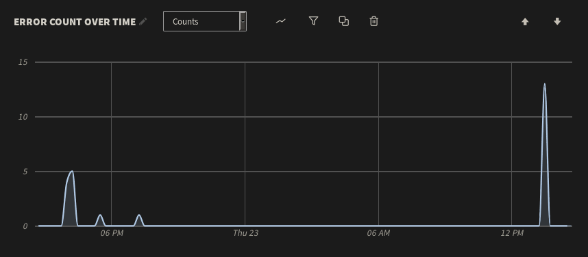
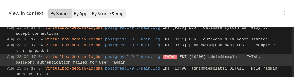
Here, we can see a few errors followed by a period of stability. A significant spike occurs shortly after 12 PM, which is roughly when the application restarted. We can view the individual log events by clicking on the spike and selecting Show Logs. For any one of these events, we can then click View in context to see the logs immediately surrounding the error. As it turns out, someone or something repeatedly attempted to log into the PostgreSQL database as an administrator with the wrong credentials. This caused PostgreSQL to log an error each time the user was denied:
In our case, it was an engineer attempting to log in via the command line. We resolved the problem by creating a new PostgreSQL user account specifically for that engineer.
2. Detecting Unusual Behavior
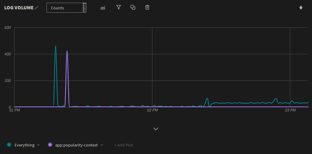
Log volume is a basic but important metric. Sudden changes in log volume can indicate errors, software or hardware failures, performance problems, or problems with the logging infrastructure itself. Restarting a server naturally results in a surge in log volume, which we can easily detect by charting log volume over time. However, any other surges could indicate larger problems. As shown below, our virtual machine experienced two major spikes in log volume followed by a period of relative inactivity:

To learn more about the cause of these spikes, we can click on the peak of each spike and use the Show Logs button to view the logs in the LogDNA dashboard. As it turns out, the first spike is the result of logs generated during the virtual machine's startup process, which is expected. The second spike, however, consists entirely of logs generated by the popularity-contest service, which records statistics about the software installed on the system. Although popularity-contest only ran for a short time, it generated almost an equivalent volume of log data as the startup process.To get a better idea of the impact that popularity-contest had on log volume, we can add a new plot to the total volume chart and filter the app field to only show events originating from popularity-contest:
Drilling Down with Histograms
Visualizing your total log volume is useful for an overall outlook, but what if you want more granularity? You may want to count log volume by a specific field such as the log level, host, application, or a custom tag.
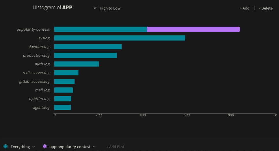
We can do this in LogDNA simply by creating a histogram and selecting the field we want to plot on. For example, let's plot out log volume based on the service that generated each event (stored in the app field). Here we can see the popularity-contest service generates the greatest number of messages, followed by the virtual machine's syslog service and daemon log:
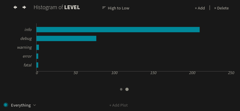
If we create a histogram using the level field instead of the app field, we see that most of these messages are either info or debug logs. However, there are still a few warning, error, and fatal logs, all of which warrant further investigation:
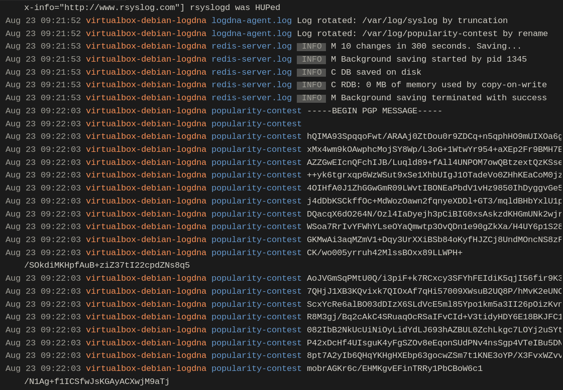
We can click on the popularity-contest spike and use the Show Logs button to view log entries originating from the service:
The solution to this problem was to disable the popularity-contest service. This resulted in slightly faster startup times, less network traffic, and lower log volumes.
3. Analyzing Changes in Performance
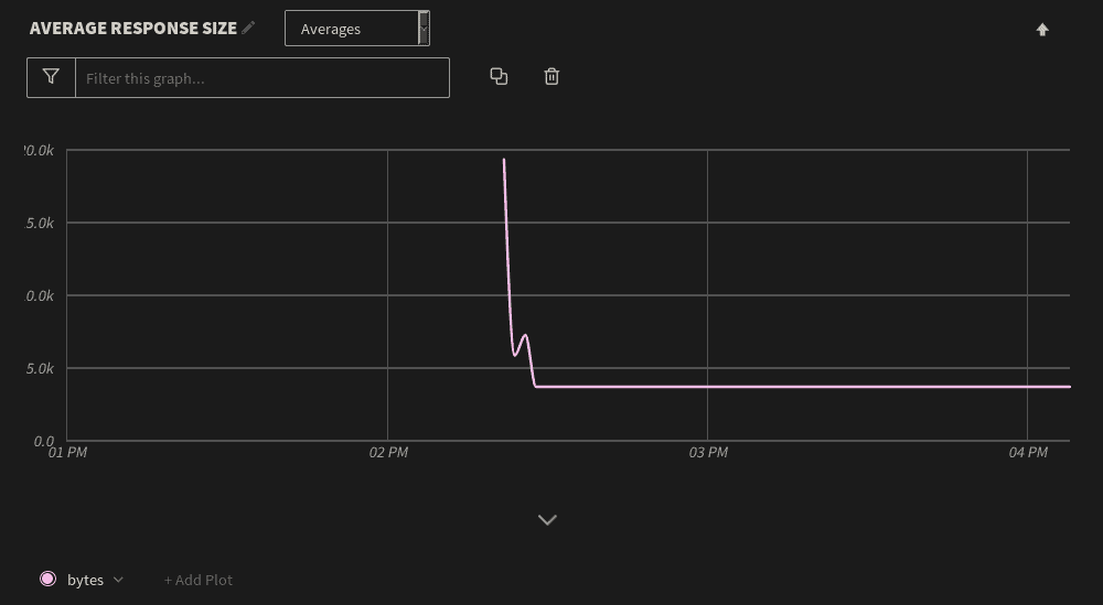
In addition to detecting unusual behavior, we can use visualization tools to track application performance metrics including response times, response sizes, and request volumes. It would be useful for your logging graphing engine to calculate and chart statistics for these metrics including averages, minimum and maximum values, sums, differences, and percentiles.For example, our web application logs the size of each response in bytes. After the restart, the average response size started off significantly higher than usual. Shortly after, the response size fell to a low and steady average:
Using percentiles, we can track metrics that fall far outside of the average, such as unusually large responses. We can do this in LogDNA by changing the metric measured from Averages to 99th Percentile, which displays the top 1% of response sizes over the same period of time:

As with other charts, we can drill-down into each data point to see the relevant log messages. As it turns out, the large responses were caused by users having to re-cache an asset-heavy page after the application was restarted. Once users stopped caching this page, the extremes fell to within 2–3 KB of the average. We can mitigate this by reducing the size of the page, updating the web server caching configuration, or by placing the server behind a content delivery network.
Conclusion
Visualizing your log data is an important step in understanding your infrastructure. While this post doesn't cover every possible use case, it does show how you can start extracting valuable insights from your logs in a matter of minutes.To get started, sign in to your LogDNA account and open the graphs tab, or sign up for a free trial account. If you want to learn more about LogDNA's graphing tools, you can read our announcement on the latest version or view the documentation.
Table of Contents
Share Article


RSS Feed

Similar blog posts